Medi-Sci
Environment
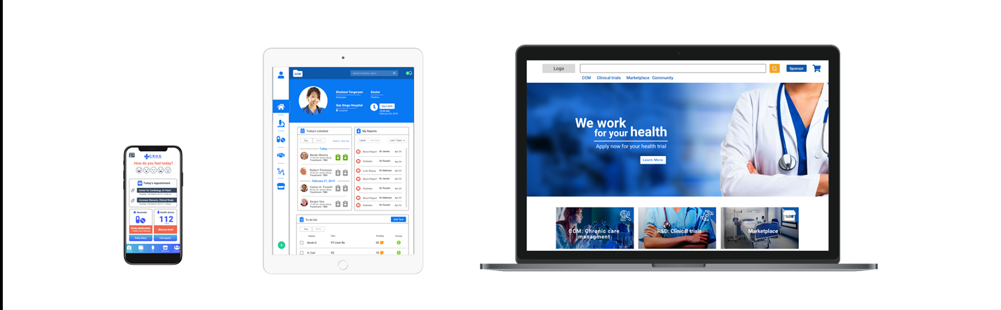
Designing a connected healthcare trials ecosystem across mobile, tablet, and web platforms.
Medi-Sci needed more than a set of digital screens. The company needed a clearer way to organize clinical trial operations across patients, clinic staff, sponsors, inventory processes, and inspection workflows.
The result was a multi-platform product ecosystem designed to connect three core experiences: a patient-facing mobile app, a tablet app for the medical team, and a web platform for sponsors and inspectors.


Company
Medi-Sci / ArkusNexus

Industry
Healthcare, Clinical Trials, Insurance, Retail

Location
San Diego, California

Role
Product Designer / UX UI Designer / Marketing Support
Timeline
3 months
Mobile App, Tablet App, Web Platform
Platforms
Download Full Project PDF
Want to review the full case study?
This project includes a complete PDF presentation with the original research structure, platform breakdown, navigation maps, design decisions, and prototype documentation.
From operational complexity to a connected product ecosystem
Medi-Sci is a healthcare trials company focused on improving the logistics behind clinical trial operations.
Their process involved multiple actors - patients, clinic employees, medical teams, sponsors, suppliers, and inspectors - but the information flow was fragmented across physical documentation, manual processes, and disconnected workflows.
My role was to help translate the client's initial business needs into a clear product direction, define the structure of the ecosystem, and design prototypes that could support real clinical and administrative scenarios before entering development.
Designing for multiple roles, permissions, and workflows
The main challenge was helping the client move from a broad business need into a product that could actually be planned, designed, tested, and developed.
Medi-Sci needed to streamline clinical trial logistics while supporting different levels of access for each type of user. Patients, nurses, doctors, managers, sponsors, and inspectors could not all access the same information. Each role required specific tools, permissions, and visibility depending on their responsibilities within the clinical trial process.
This required thinking beyond individual screens and designing a connected digital environment where
each platform served a specific purpose while still contributing to the larger operational system.

Three connected platforms
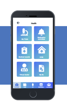
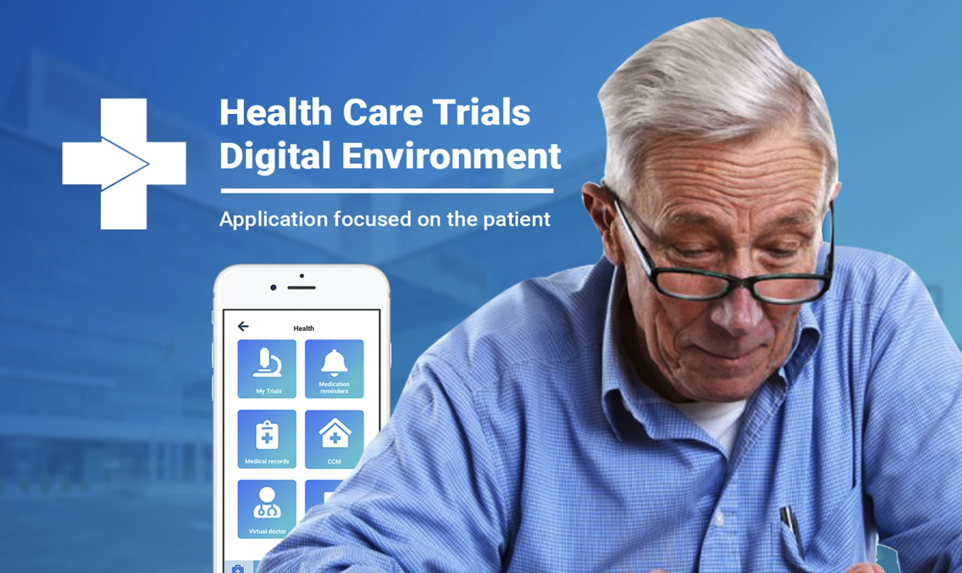
Patient Mobile App
The mobile app was designed for patients participating in clinical trials. Its goal was to make the clinic experience faster, easier, and more trackable.
● Clinic check-in and consultation number
●Appo intment information and medication reminders
● Medical records and health device connection
● Insurance access and treatment follow-up
● Trial discovery, marketplace access, and clinic communication
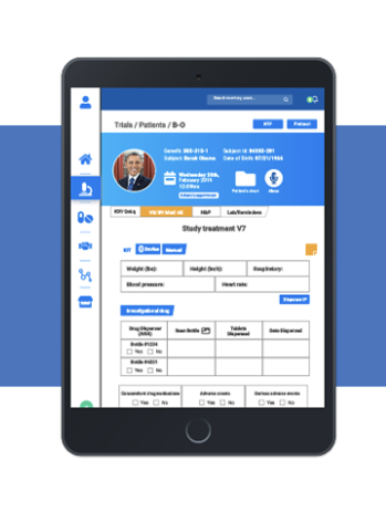
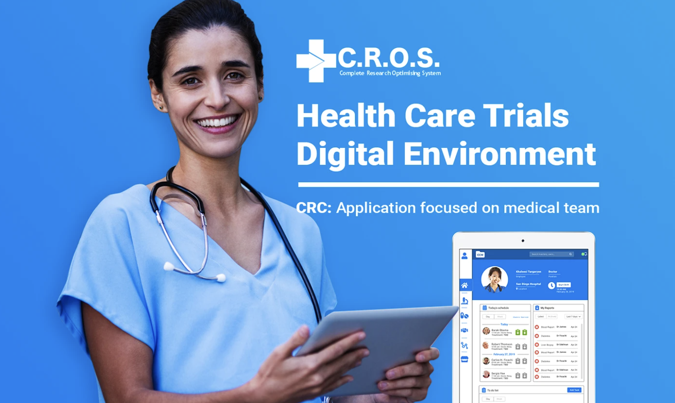
CRC Tablet App
The CRC tablet app was designed for the medical team, including nurses, doctors, inventory staff, and managers. It became the operational layer of the ecosystem.
● Today's schedule, patient profiles, reports, and to-do lists
● Medical documentation and documentation review
● Inventory review and role-based access
● Doctor and nurse workflows
● Review and approval flows for clinical operations
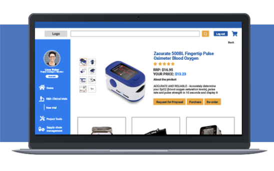
Sponsor / Inspector Web Platform
The web platform was designed for sponsors and inspectors managing the administrative side of
the clinical trial ecosystem.
● Sponsor profiles and inventory management
● Medical product listings and marketplace administration
● Medication shipment status
● Clinical trial uploads and documentation review
● Inspector workflows and administrative supervision
Understanding the system before designing the interface
The research process included interviews, surveys, field visits, and medical documentation review.
The goal was to understand how patients, nurses, doctors, sponsors, inventory staff, managers, and
inspectors interacted with the existing process. This helped define user needs, access levels,
documentation requirements, and product priorities.
Patient pain points during clinic visits
Medication tracking needs
Insurance-related friction
Staff hierarchy and access levels
Physical documentation that needed to become digital
Inventory and medication tracking requirements
Inspection and review workflows
Differences between what could be redesigned and what needed to remain structurally consistent
Continue communication between departments
Divide by user context, connect through the ecosystem.
The UX strategy focused on creating a system where every platform had a clear role.
Instead of forcing every user into the same interface, the product was divided by context:

Patients needed simplicity.
The mobile app prioritized quick actions, reminders, appointments, and treatment follow-up.

Medical teams needed speed and control.
The tablet app focused on schedules, records, reports, documentation, and operational tasks.

Sponsors and inspectors needed visibility.
The web platform focused on inventory, documentation, shipments, records, and administrative review.
This structure allowed the product to support multiple workflows without overloading any single user experience.
Product decisions that shaped the system

Not every user needed the same information, and not every role could edit or review the same data.


for sponsors and inspectors.


Download Full Project PDF
Want to review the full case study?
This project includes a complete PDF presentation with the original research structure, platform
breakdown, navigation maps, design decisions, and prototype documentation.