Brand &
Visual Identity
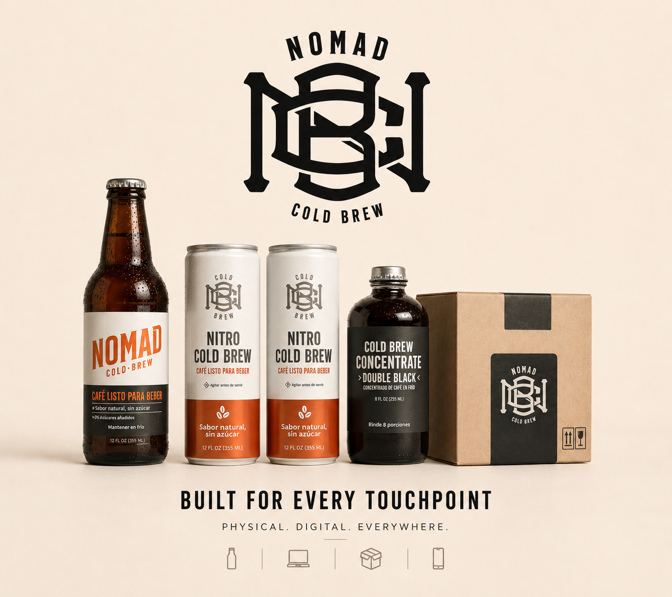
NOMAD COLD BREW
The identity of Nomad Cold Brew was developed alongside the operational, retail, and product challenges of launching a cold brew company from scratch.
Branding decisions were never isolated from the business - packaging, photography, communication, logistics, and product perception all evolved together as part of the same system.
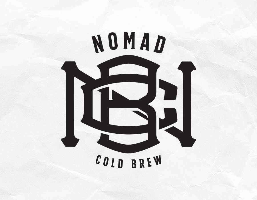
BRAND RECOGNITION
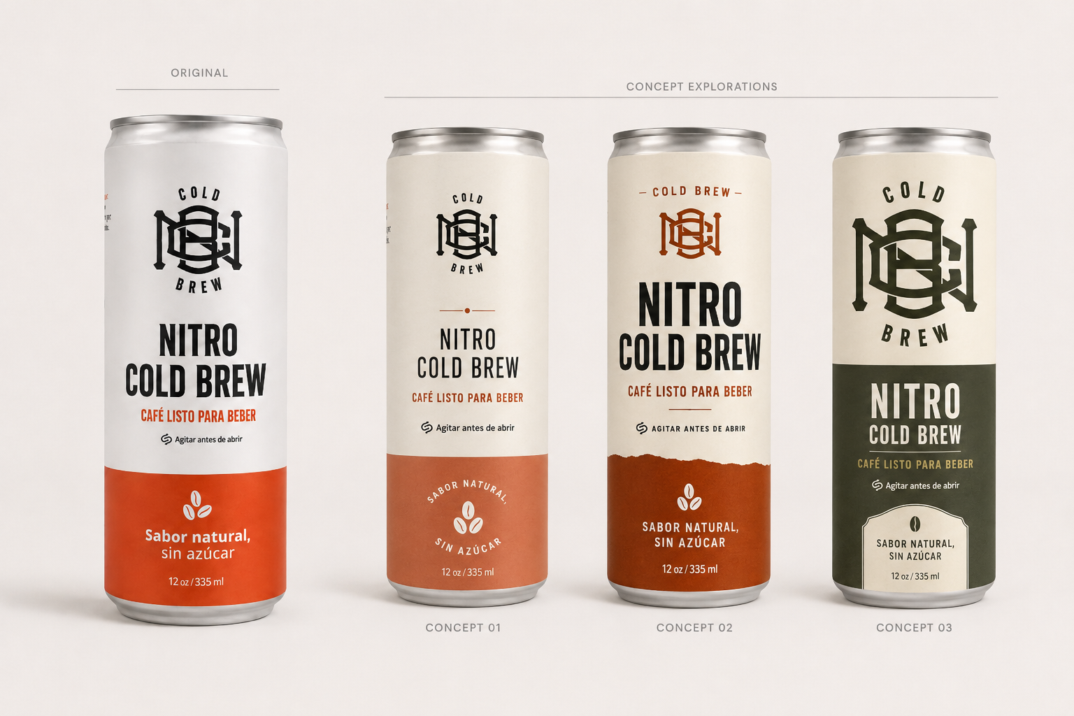
Designing a logo system built to survive beyond the product itself.
The development of the Nomad monogram became one of the longest and most intentional parts of the branding process. Over approximately three to four months, the identity evolved alongside recipe testing, product experimentation, packaging trials, and early production workflows.
Rather than following traditional coffee branding aesthetics, the direction focused on creating a bold and recognizable symbol capable of standing independently across cans, stickers, photography, merchandise, social media, and retail applications without always relying on the full brand name.
The final monogram was intentionally designed with strong visual density, interlocking geometry, and high contrast to improve memorability, shelf recognition, and adaptability across both digital and physical environments.
As the company evolved operationally, the monogram became more than a logo - it became the visual anchor connecting product, packaging, communication, and brand perception into a single recognizable system.
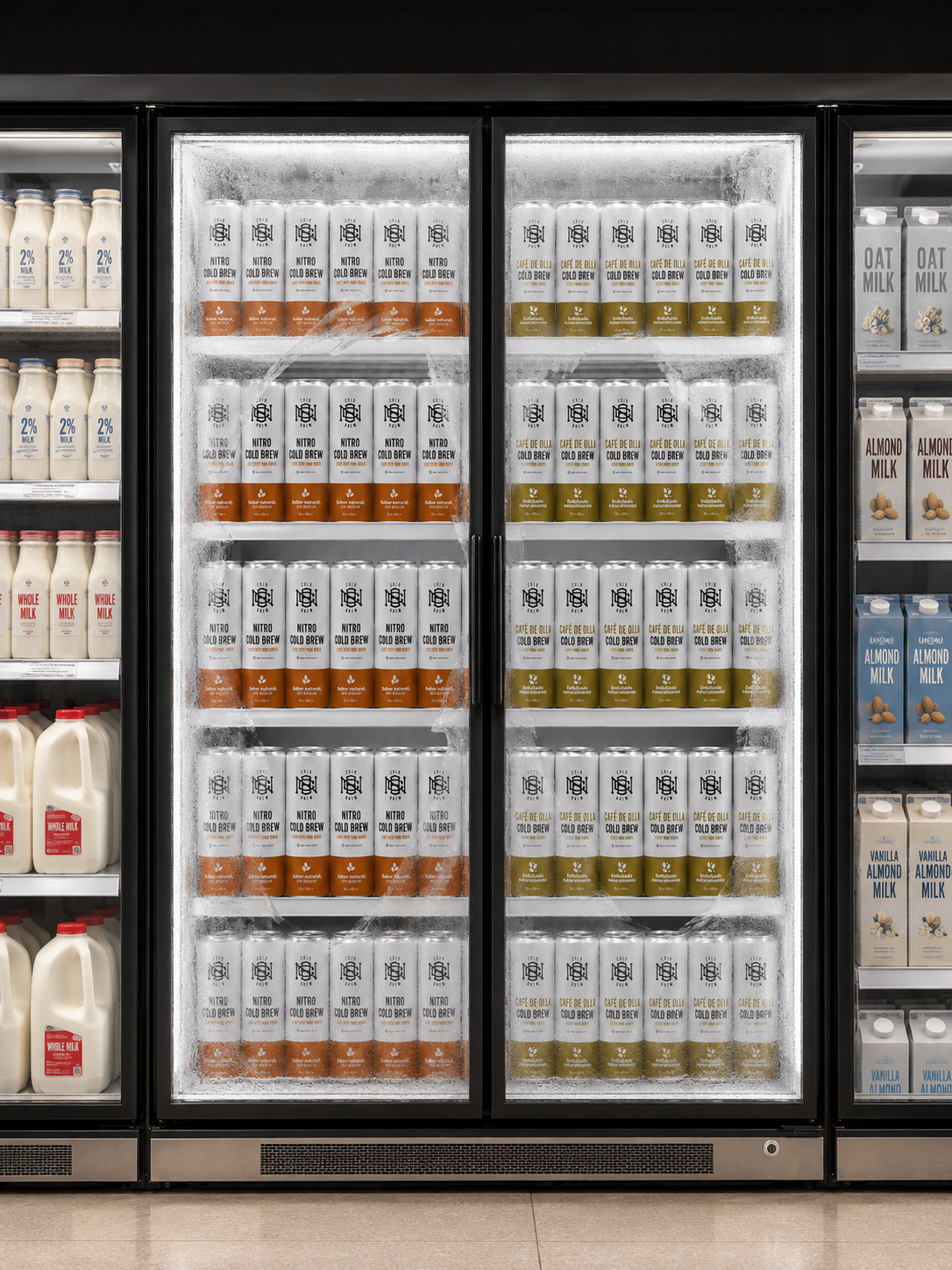
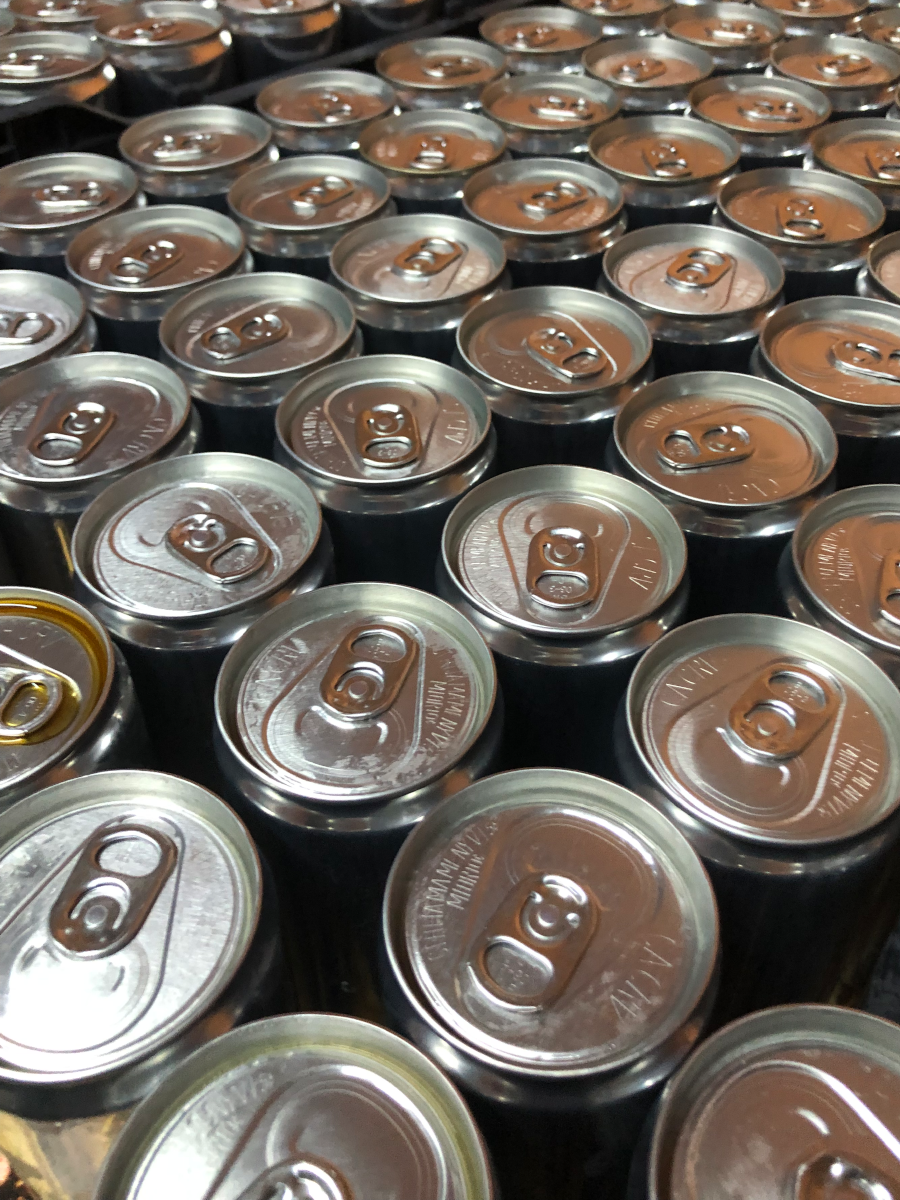
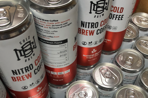
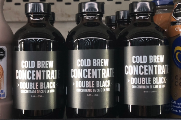
RETAIL PRESENCE
Designing for fast recognition inside real retail environments.
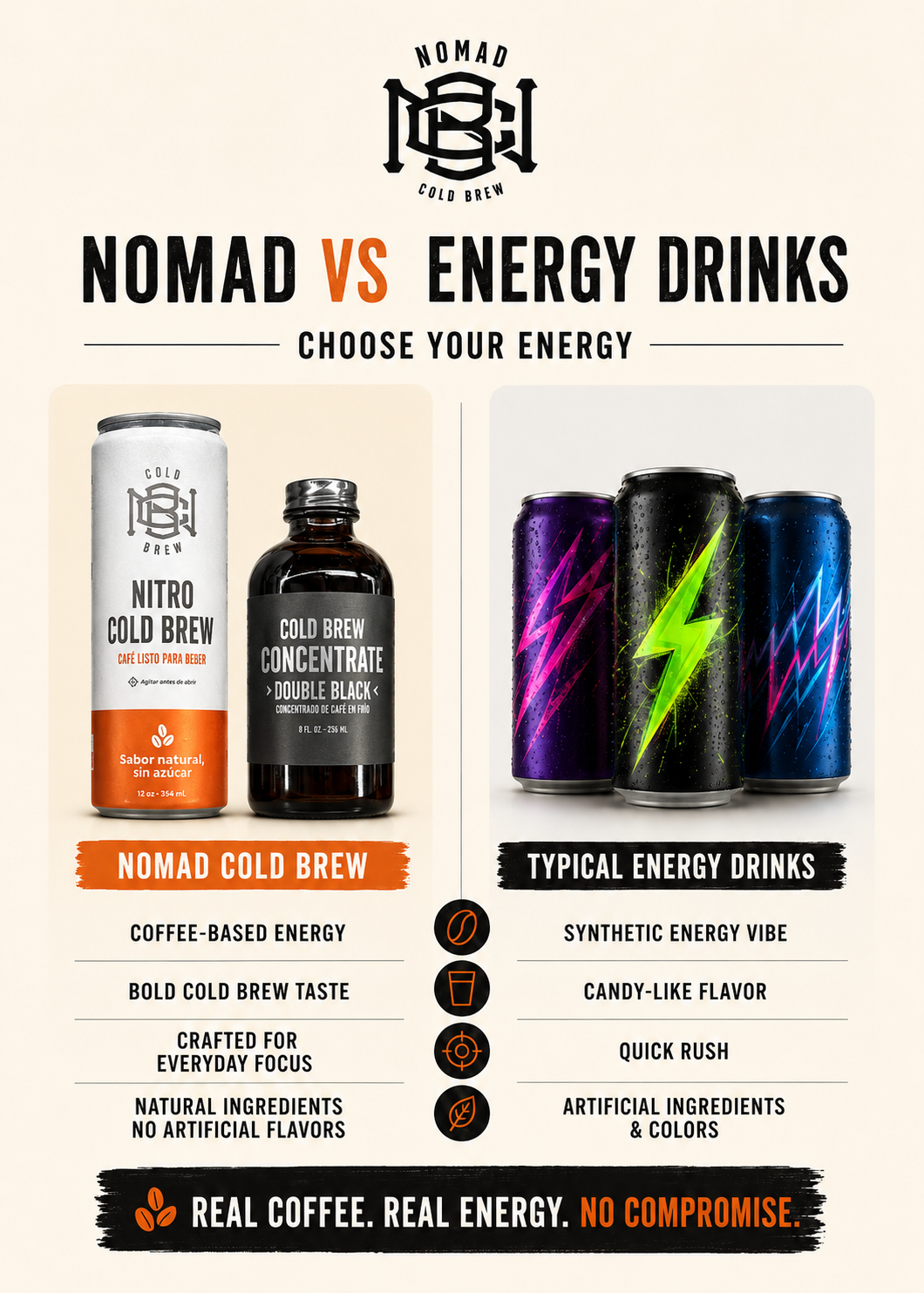
From the beginning, the visual identity was developed with retail behavior in mind. Packaging contrast, typography weight, product framing, and logo visibility were intentionally designed to improve recognition inside crowded refrigerators and retail shelves where products compete for attention within seconds.
The objective was not simply creating attractive packaging, but building a product capable of standing apart from more traditional coffee brands through stronger silhouette recognition, cleaner layouts, and a more
contemporary visual language inspired by lifestyle and beverage culture.
As retail opportunities expanded, shelf visibility became directly connected to customer perception, brand trust, and product recall.
BRAND DEVELOPMENT
Building the brand while the product was still being shaped.
The brand was developed in parallel with the cold brew recipes, production process, packaging decisions, and early retail strategy. This meant the identity was not created as a decorative layer after the product was finished; it was shaped by the same business questions the company was trying to solve.
The work required connecting visual identity with product positioning, operational feasibility, customer perception, and long-term scalability. Each decision had to support how the product would look, sell, ship,Nomad Cold Brew - Brand & Visual Identity 2
scale, and remain recognizable as the company grew.
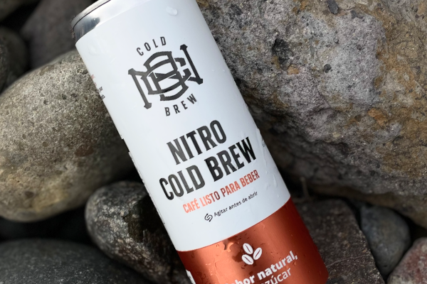
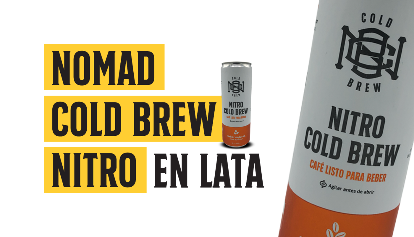
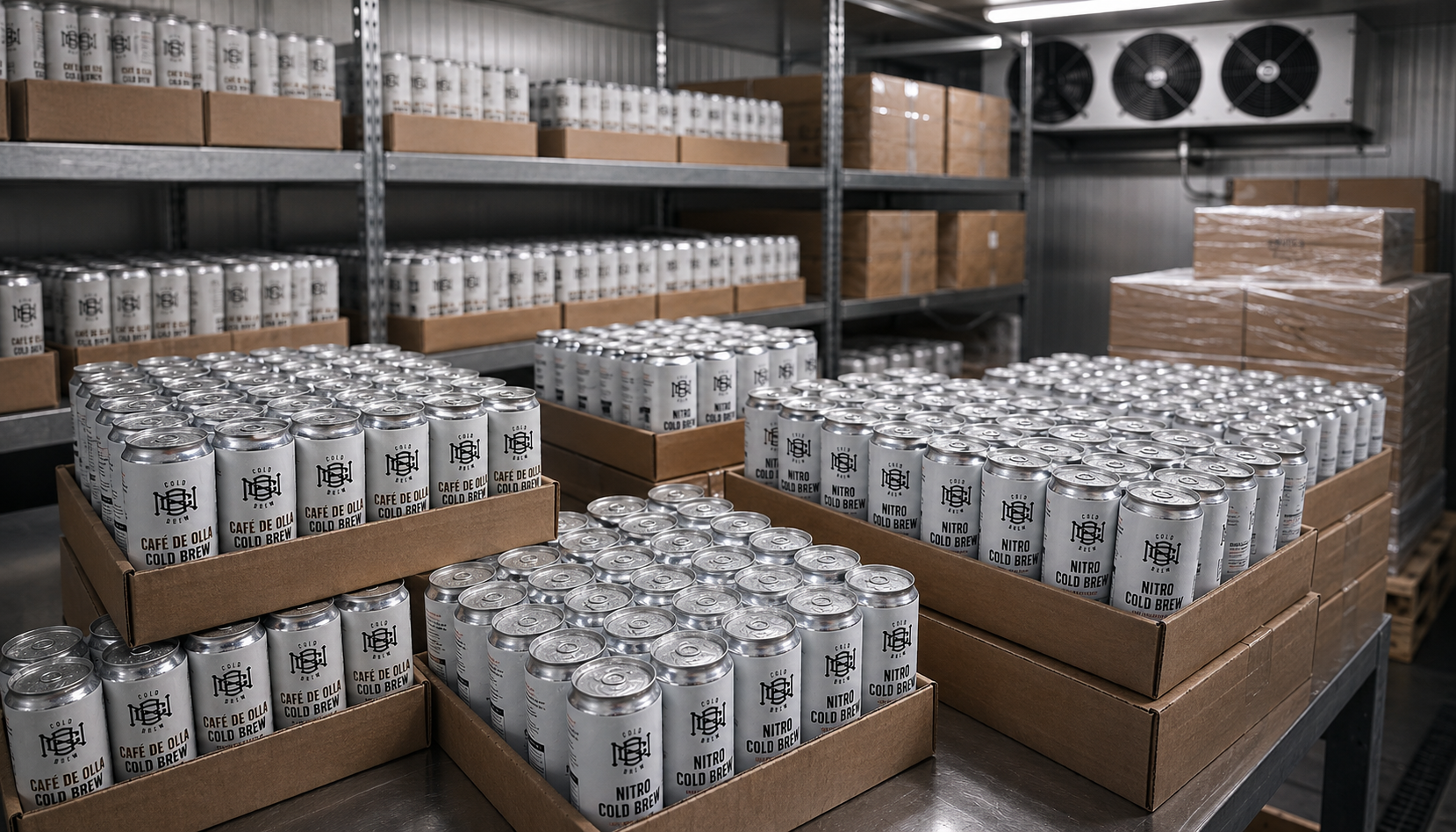
DIGITAL COMMERCE
Building a brand system capable of working both physically and digitally.
As the company expanded into marketplaces and shipping-based sales, branding decisions became closely connected to transportation, packaging durability, thumbnail readability, and digital customer perception.
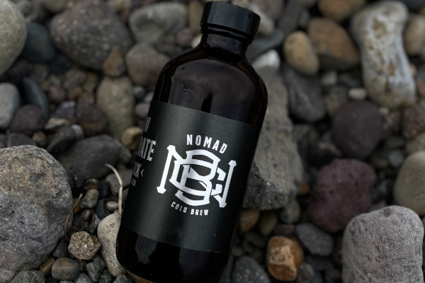
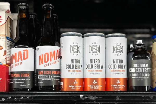
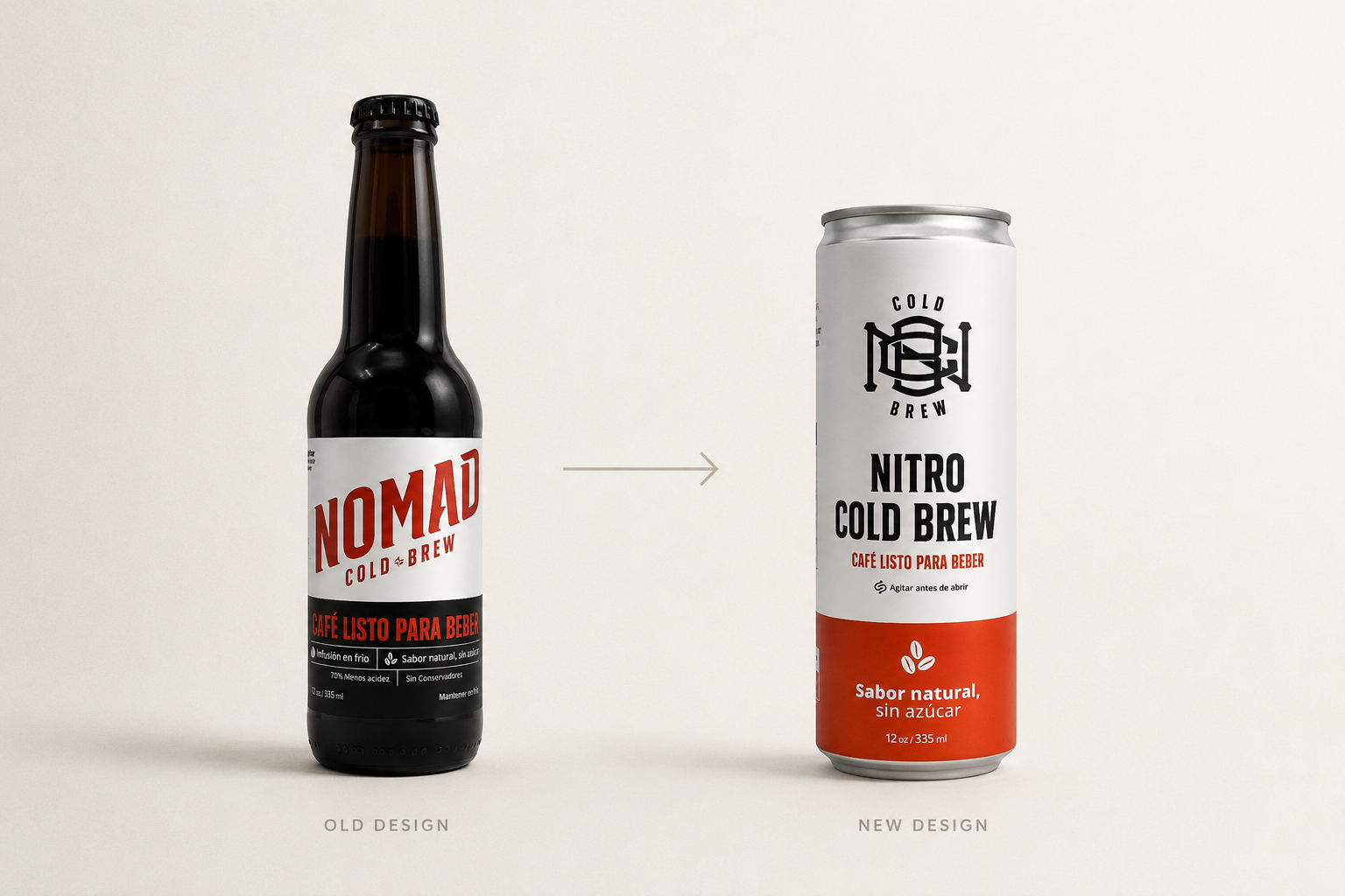
The transition from glass bottles to cans improved logistics and scalability, but it also strengthened the visual consistency of product photography, online listings, and marketplace presentation across platforms like Mercado Libre and Walmart.
The identity system needed to function equally well inside retail refrigerators, mobile search results, social media feeds, and shipping boxes.
Shipping-Based Sales
Branding decisions became connected to transportation, packaging durability, and shipping-based customer perception.
Marketplace Presentation
Product photography and online listings needed to remain visually consistent across platforms like Mercado Libre and Walmart.
Thumbnail Readability
The identity system had to work clearly inside mobile search results, marketplace feeds, and digital product previews.
Physical & Digital Consistency
The brand needed to function equally well in retail refrigerators, social media feeds, shipping boxes, and online commerce.
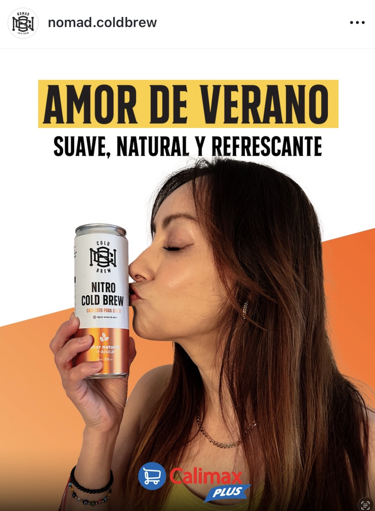
INBOUND COMMUNICATION
Creating a scalable visual language across content and
campaigns.
Social media was approached as an extension of the brand system rather than a collection of isolated marketing posts. Photography direction, typography usage, color consistency, layouts, and product framing were developed together to create faster recognition across feeds and campaigns.
This helped build a more scalable inbound communication system where content could continuously evolve while still maintaining visual consistency with the product experience, retail identity, and overall perception of the brand.
The objective was making the brand feel cohesive regardless of whether customers discovered it through retail, Instagram, marketplaces, or word of mouth.
SYSTEM FLEXIBILITY
Designing a brand capable of supporting future product growth.
The visual system was intentionally developed to support future expansion beyond a single product format.
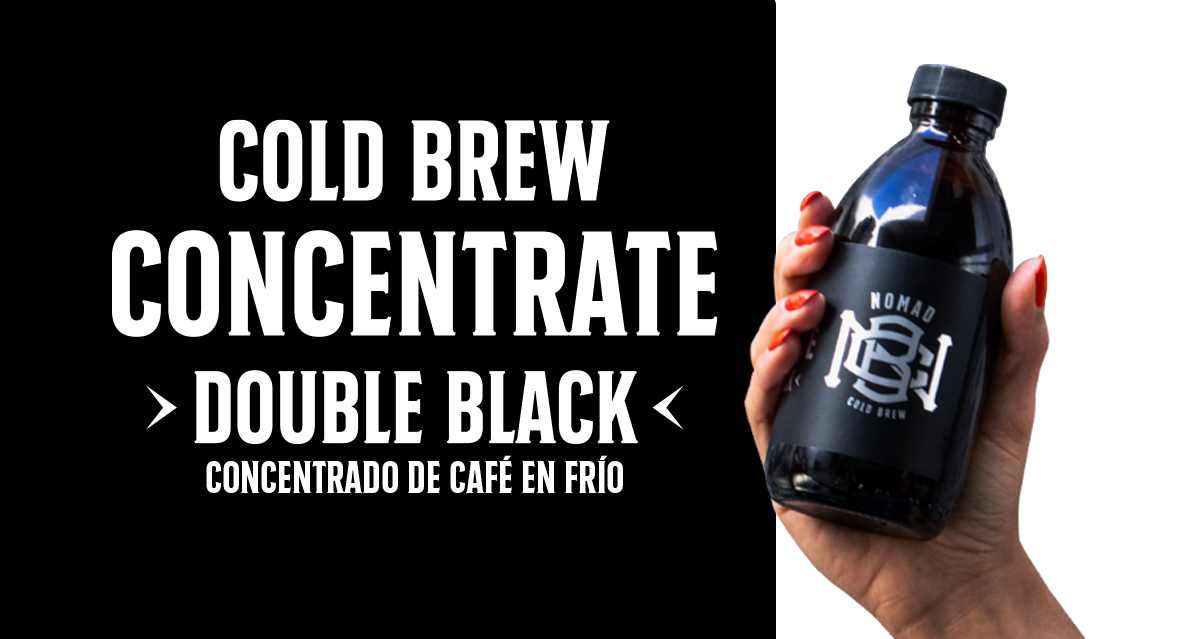
Ready-to-drink cans, concentrates, seasonal variations, and future SKUs were considered throughout the branding and packaging process to avoid creating a system limited to one product line.
This allowed the identity to remain visually consistent while still leaving enough flexibility for future packaging, retail, and communication needs as the company continued evolving operationally.
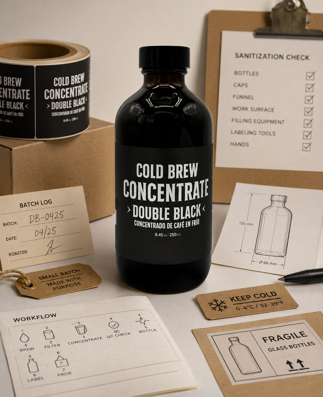
OPERATIONAL BRANDING
Building branding around real production realities.
The brand was developed simultaneously with operational systems, production workflows, sanitization processes, labeling methods, and packaging limitations inside a growing small-batch environment.
This created a much more grounded design process where branding decisions needed to function not only aesthetically, but operationally - from printing consistency and packaging application to transportation, shelf life, and day-to-day production execution.Nomad Cold Brew - Brand & Visual Identity 4 Over time, the visual identity became deeply connected to how the company actually operated behind the scenes.
TRADEMARK & NAMING CONSTRAINTS
The naming and trademark process created an important strategic constraint during the identity development.
After challenges with the original brand direction and the IMPI registration process, the brand had to be reconsidered without losing the clarity, personality, and scalability already being built around the product.
This reinforced the need for a stronger identity system - one that could adapt to legal, operational, and market realities while still preserving recognition and long-term brand value.
LONG-TERM VISION
Building a brand designed to grow with the business.
What started as the development of a cold brew product gradually evolved into the construction of a complete brand system connected to retail, operations, content, packaging, logistics, and customer perception.
Every stage of growth introduced new constraints, forcing the identity to adapt without losing consistency.
Packaging needed to scale, photography needed to communicate faster, content needed to remain recognizable, and the overall system needed to function across both physical and digital environments.
Over time, the brand became more than a visual identity - it became a framework capable of supporting how the company operated, communicated, expanded, and positioned itself in increasingly competitive spaces.
Final statement: The objective was never simply creating a coffee brand, but building a system capable of evolving alongside the business itself.